Ilona Khomenko
UI/UX Designer
Go back to main page
Contact me: ilonasurdream@gmail.com
Gate manager case: Internship (2023)
I was an intern at a dynamically growing scale-up, doing user research, prototyping, and presenting my work to the teams. Our team was: me, 2 backend developers, a frontend developer, a product manager, and QA.
This is the case I want to tell about how I proposed the design solution for a particular problem I discovered during usability testing.
Understanding the context
Toogethr is an innovative B2B company that creates solutions for parking. Users are gate managers who interact with a parking web app in their everyday work. The Toogethr web app helps keep track of parker bookings and transactions. Usually, the license plates of parkers are scanned and they’re let in automatically, but in some cases,
it’s not readable or the booking is required to be let in, and they ring the bell. So gate managers answer this call and have to check if a parker has a reservation. There are also parking rules that may vary, and they're taken into consideration in design too.
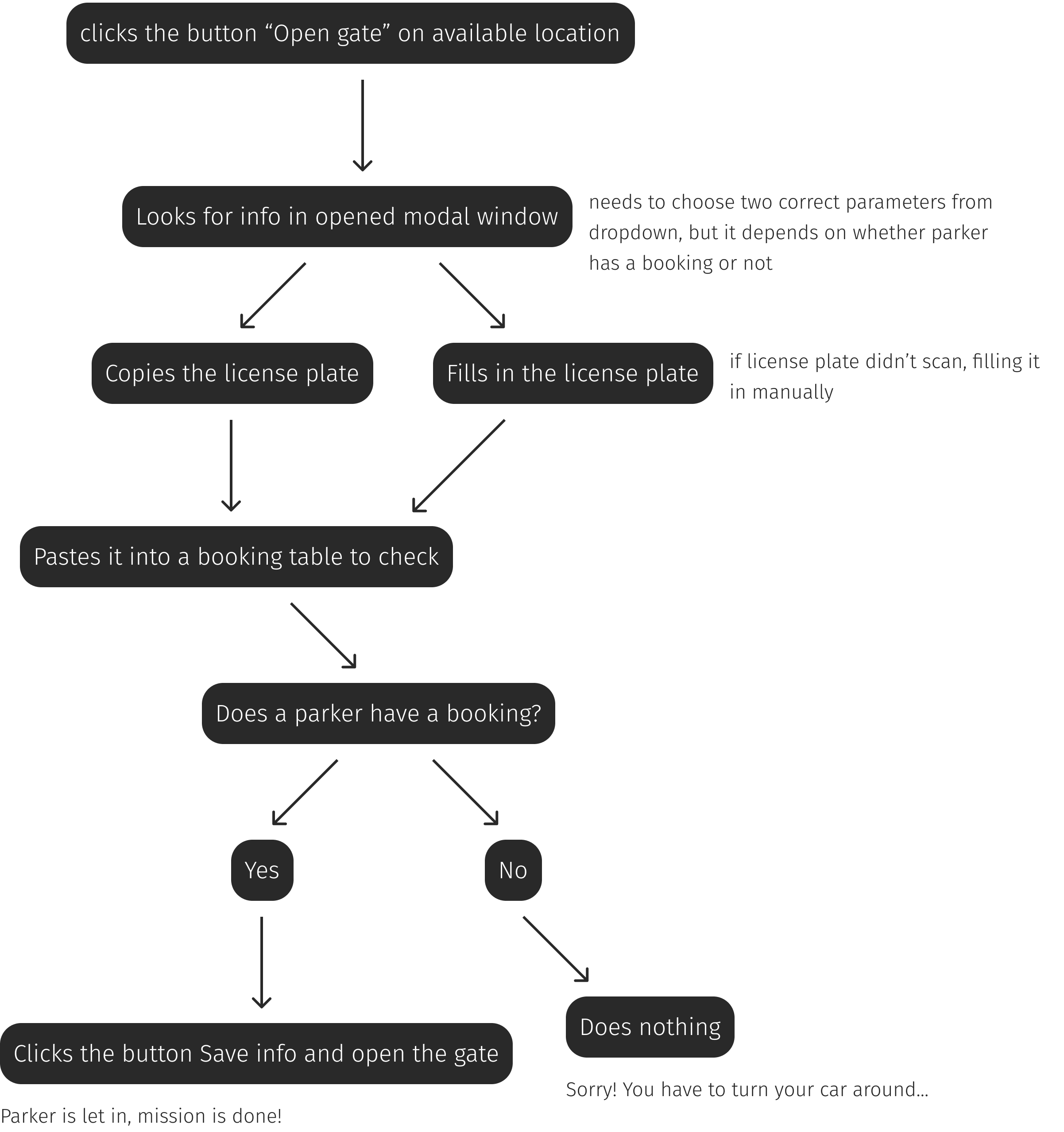
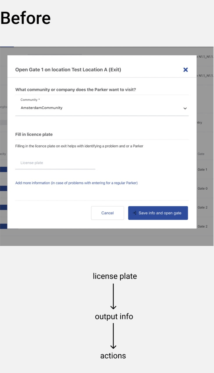
Previous user flow had problems not showing all information related to a parker. To let a parker in, a gate manager should know if this person has a booking. To do it, they had to copy the license plate from the modal window and go to another tab in the web application to paste it there to see the bookings. Also, there’s another problem: users don’t come, and their spot is taken up and cannot be used by others.
To reduce the steps the user takes to reach their goal. They don’t need to go to the separate tab to see the info they need, we can show it in the modal all at once. In the previous flow gate manager had to choose subscription also, but in most cases it’s already known. So there’s no need to do this additional step. For the second problem, there should be an opportunity to let parkers in for some time, despite the fact that spots are full.
-
business risks.
Gate managers get tired of copy-pasting every time, and clients get nervous while waiting, so all this may encourage them to start using another parking web application without these flaws;
-
declining in hospitality of the particular parking lot at the business center in general, which makes this place less attractive and gets people nervous;
-
The waiting time increases for parkers (they have to wait until the gate manager defines the problem, why they can’t be let in), which creates the queues. If all spots are full, they have to wait too or leave.
Understanding the context
So, a gate manager starts to communicate with a parker who can’t be let in.
-
What is working here?
Gate managers can find information about parker they need to open the gate.
-
What is not working?
Gate managers don’t see all the information they need, and they have to copy info and switch to another tab all the time.
-
What could be improved?
Why do they even need to switch between two tabs? Everything they look for can be stored in one place.
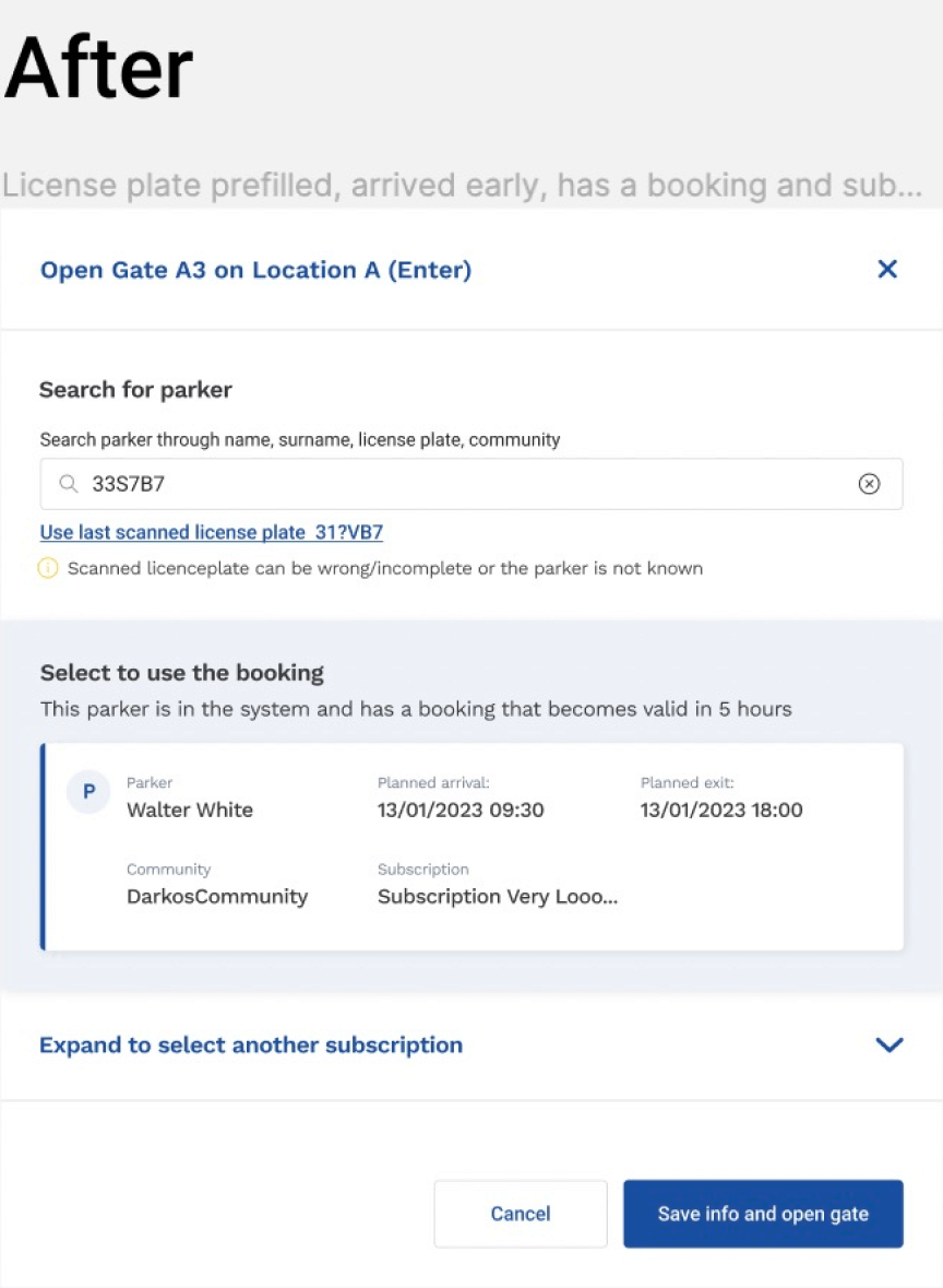
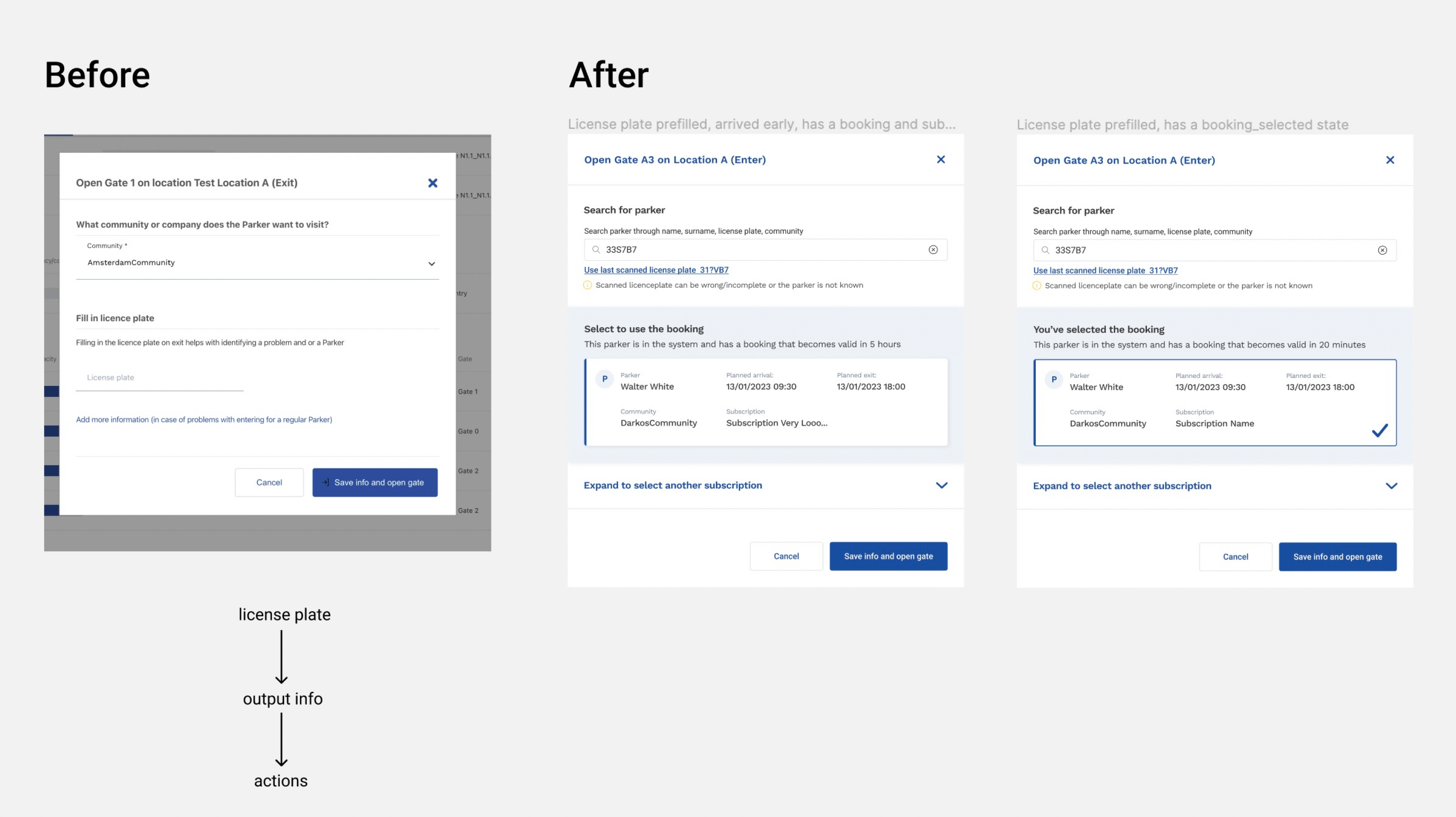
Finalised UI
Modal window with parker data and CTA "Save info and open the gate". The goal is to open the gate at a chosen location (CTA called "Save info and open the gate" or "Close the transaction and open the gate").
-
Removed the field "Add more information...", because, according to analytics, almost nobody uses it.
-
Modals for enter and exit are slightly different, but the main focus is on the different outputs for the modal window on enter because there are more issues.
-
Clear output with parker info. There’s always a license plate filled in the search field. It may not always be correct, and the user can edit it.
Result
The previous UI didn’t cover cases with subscription issues. I suggested using the pattern with card output because we already used cards in other parts of the application that I can’t show here. Priority is to show bookings first. If there are some issues, then show the card with a parker and related issue. So, if the subscription is expired, we show it.
If we can define any problems related to subscriptions or unclosed transactions, we can solve them by showing info about the transaction and the button that closes this transaction and opens the gate at the same time. See some examples of designs in the screenshots below, both for entry and exit.
-
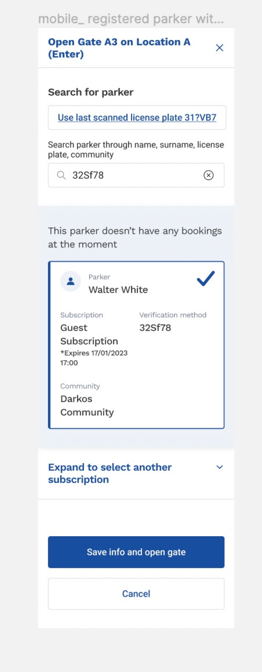
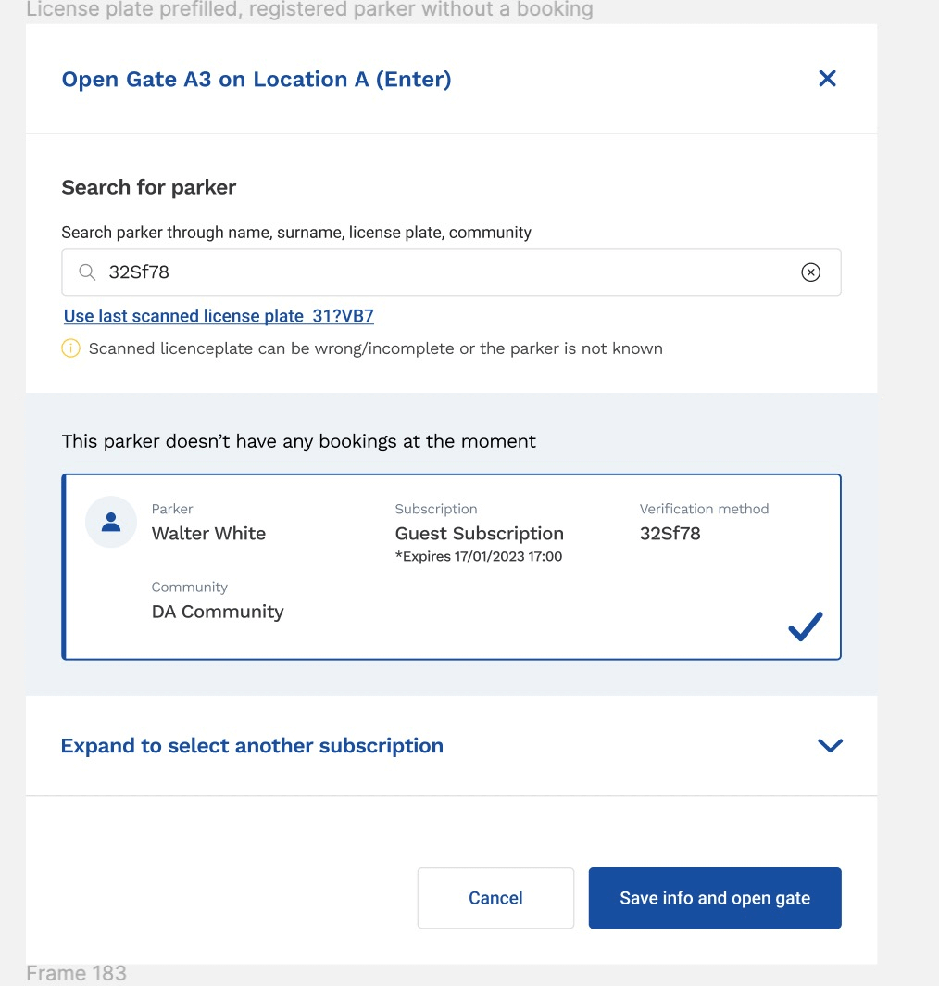
Parker has no booking, but this parker has been at the parking lot before. The data is known, we show it on the card in the area that is slightly highlighted in blue;
-
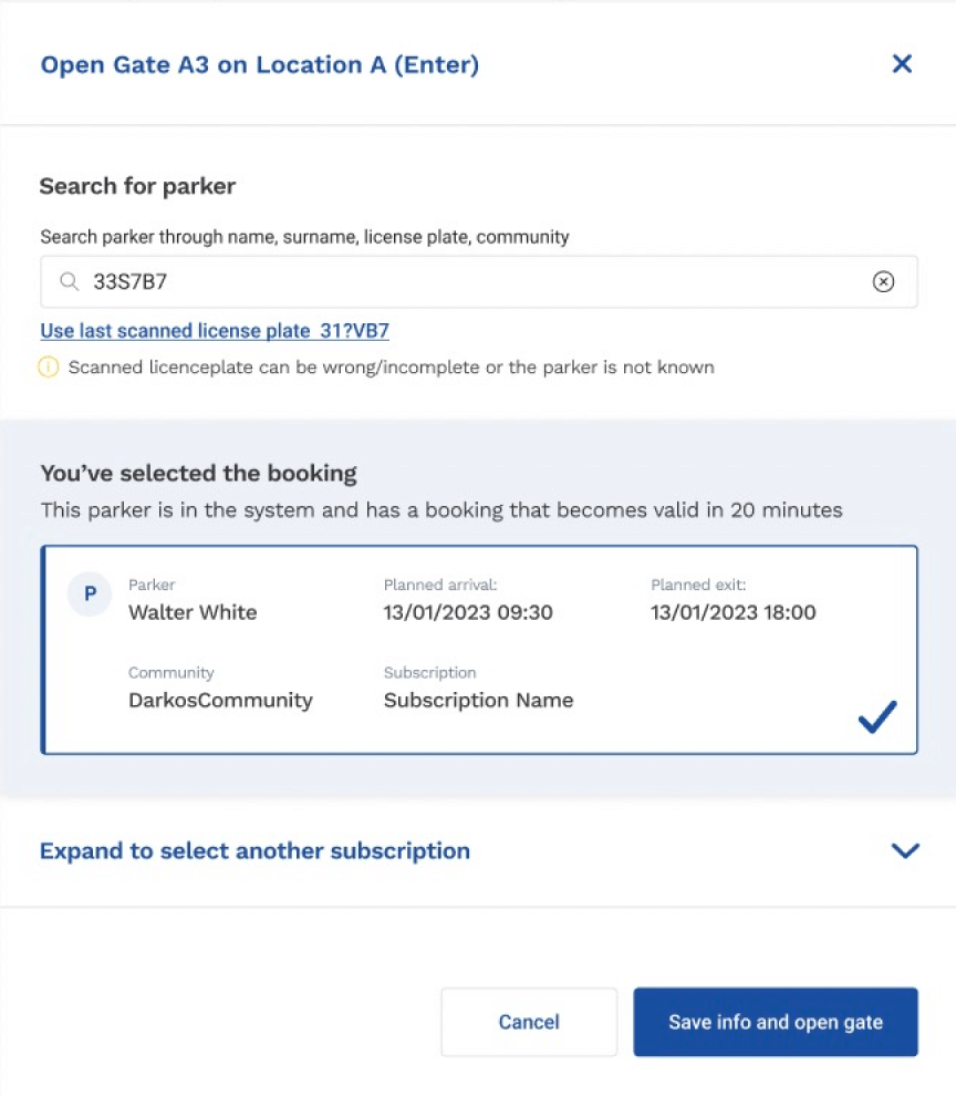
Card with info has selected state;
-
The section with the subscription dropdown is wrapped because the required subscription is already there in the card, and it’s selected. It’s wrapped not to distract the user.
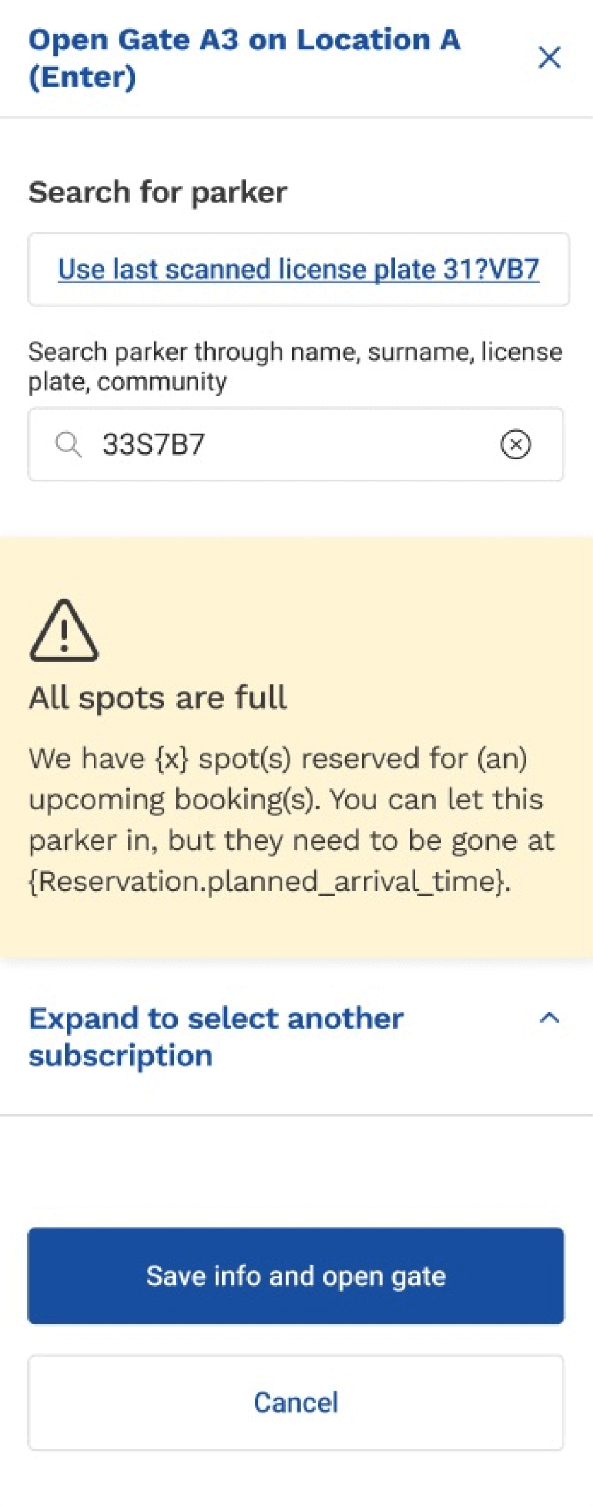
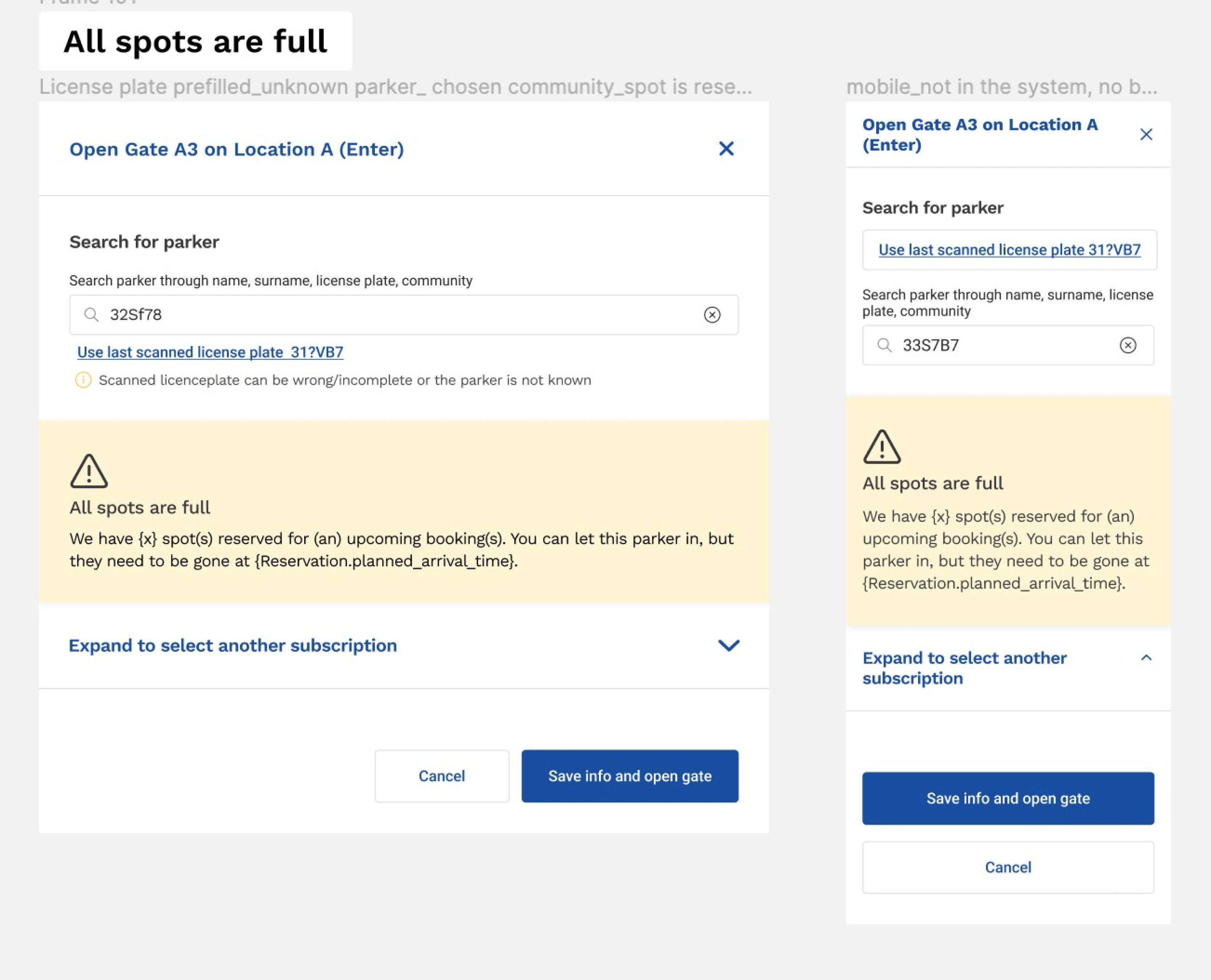
When we have a problem and the parking lot is full, we show a warning message to the gate manager. Parker may be let in to use this reserved spot for some time.
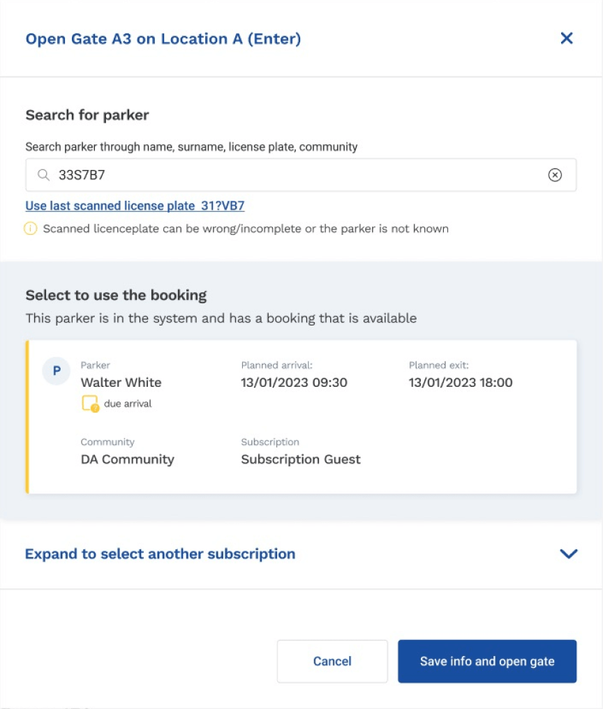
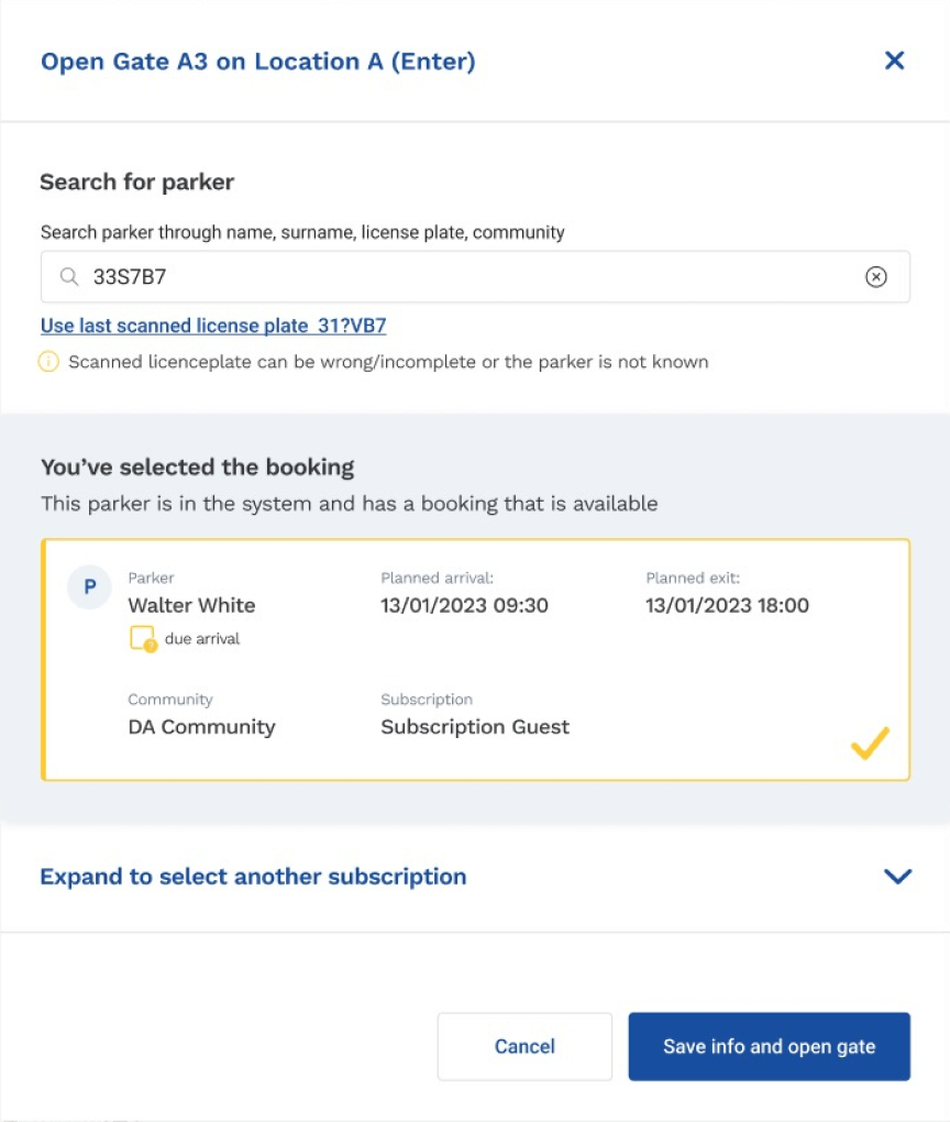
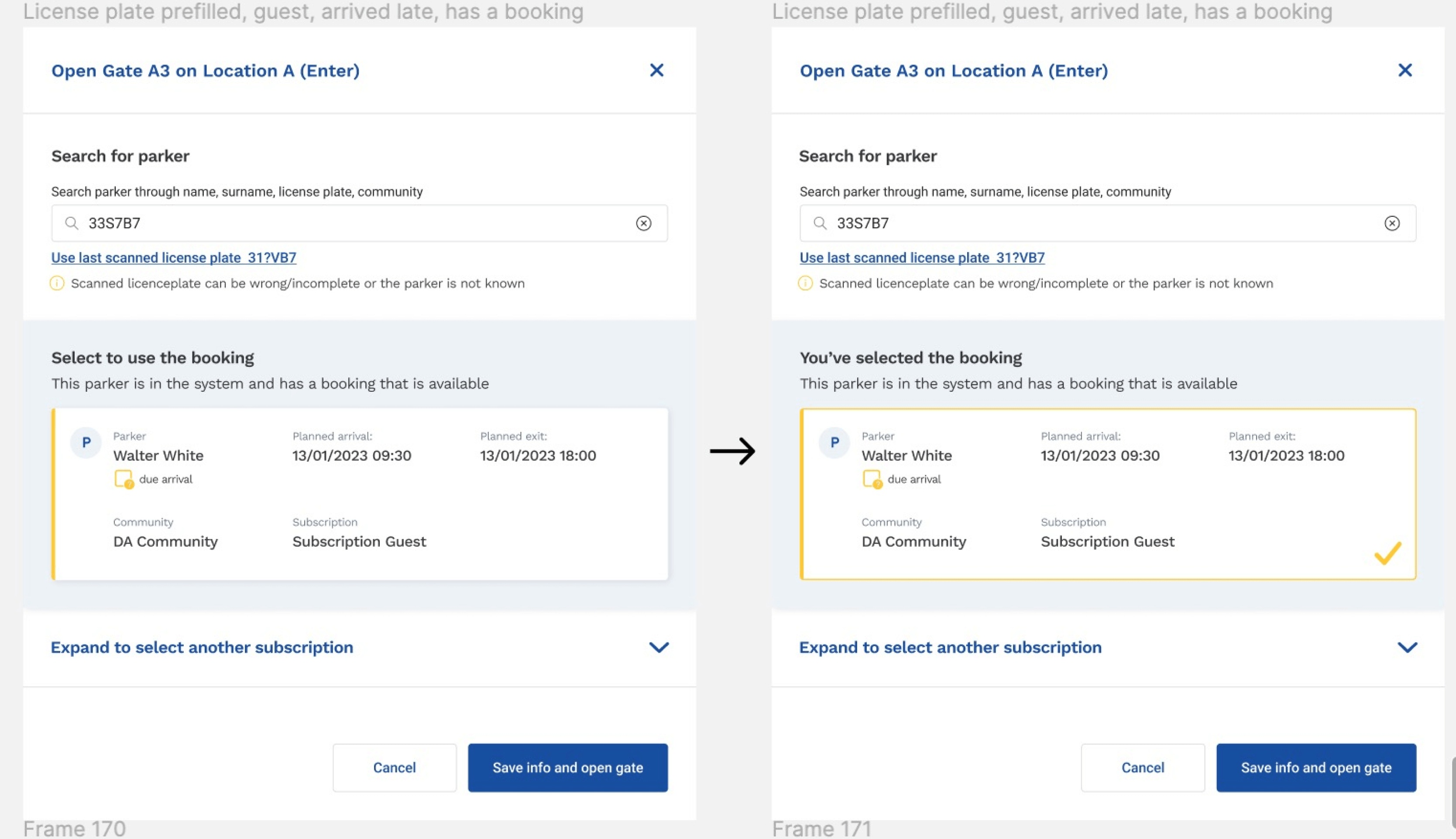
This is the case when parkers arrive later when their booking is already started and available. State before and after selecting the booking. The cards have a warning yellow color that highlights those parkers who are being late.
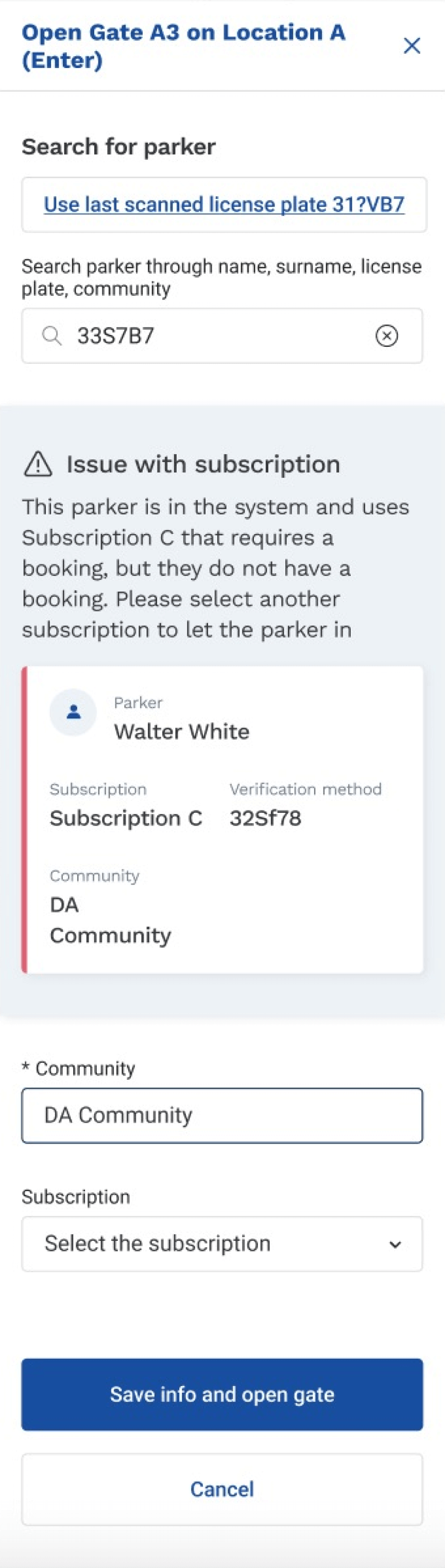
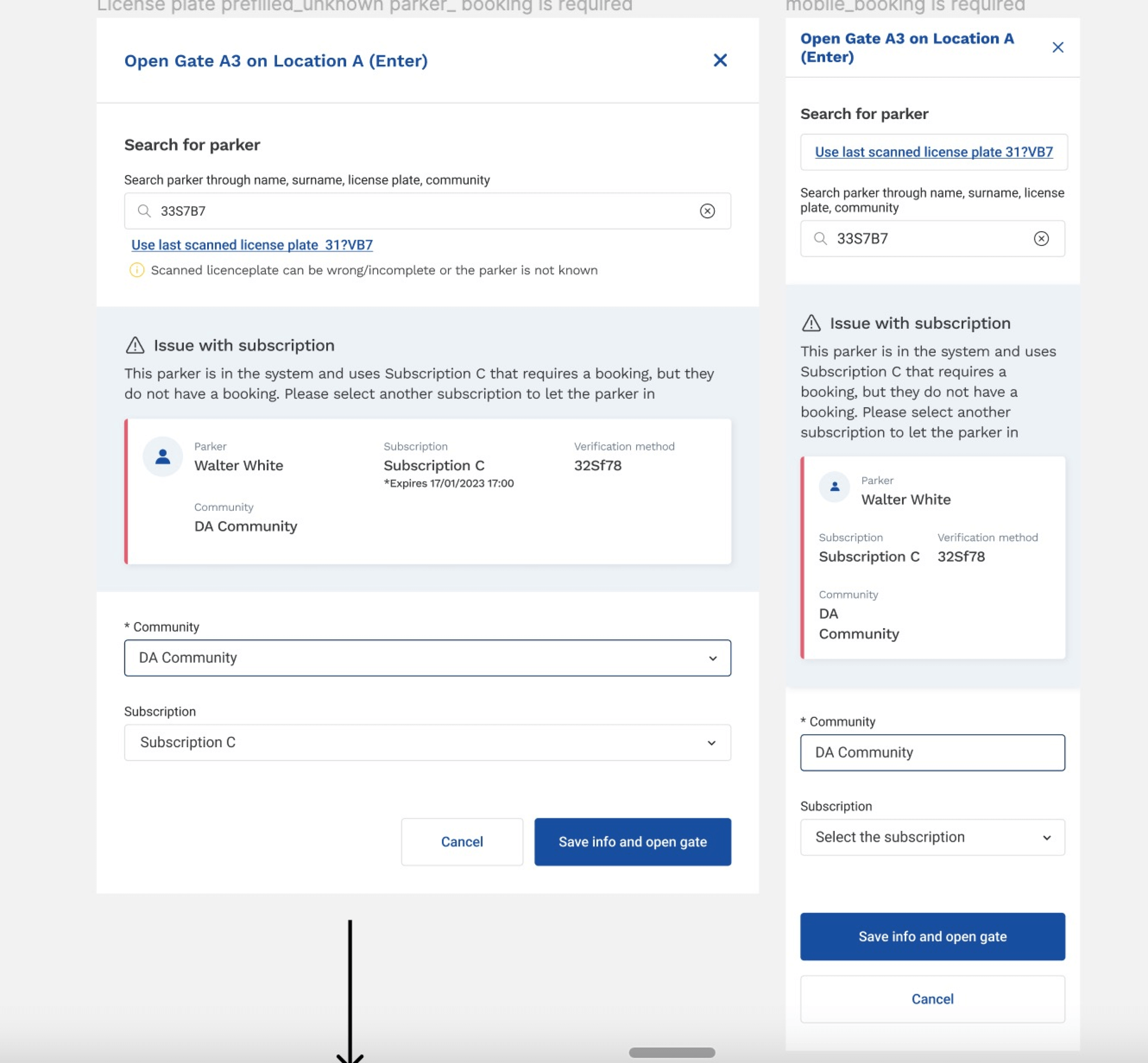
There can be a situation when parker arrives and doesn’t have a booking. It’s possible to solve this by selecting another subscription that doesn’t require a booking. Cards have a red border to attract attention that this is an issue the user should know about to make a better decision in the current situation.
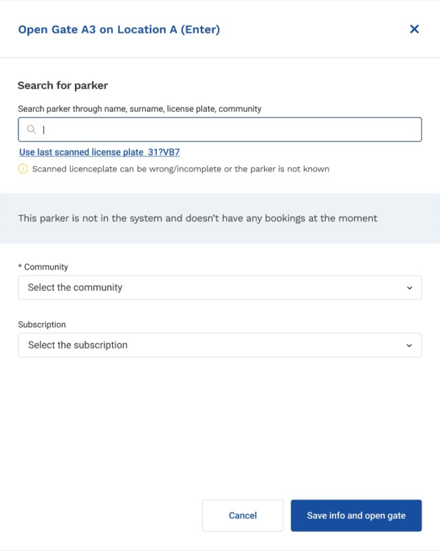
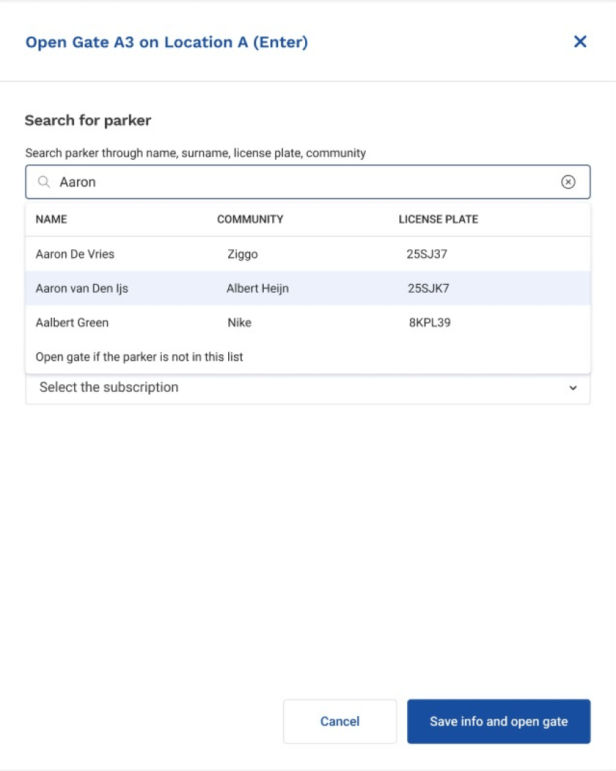
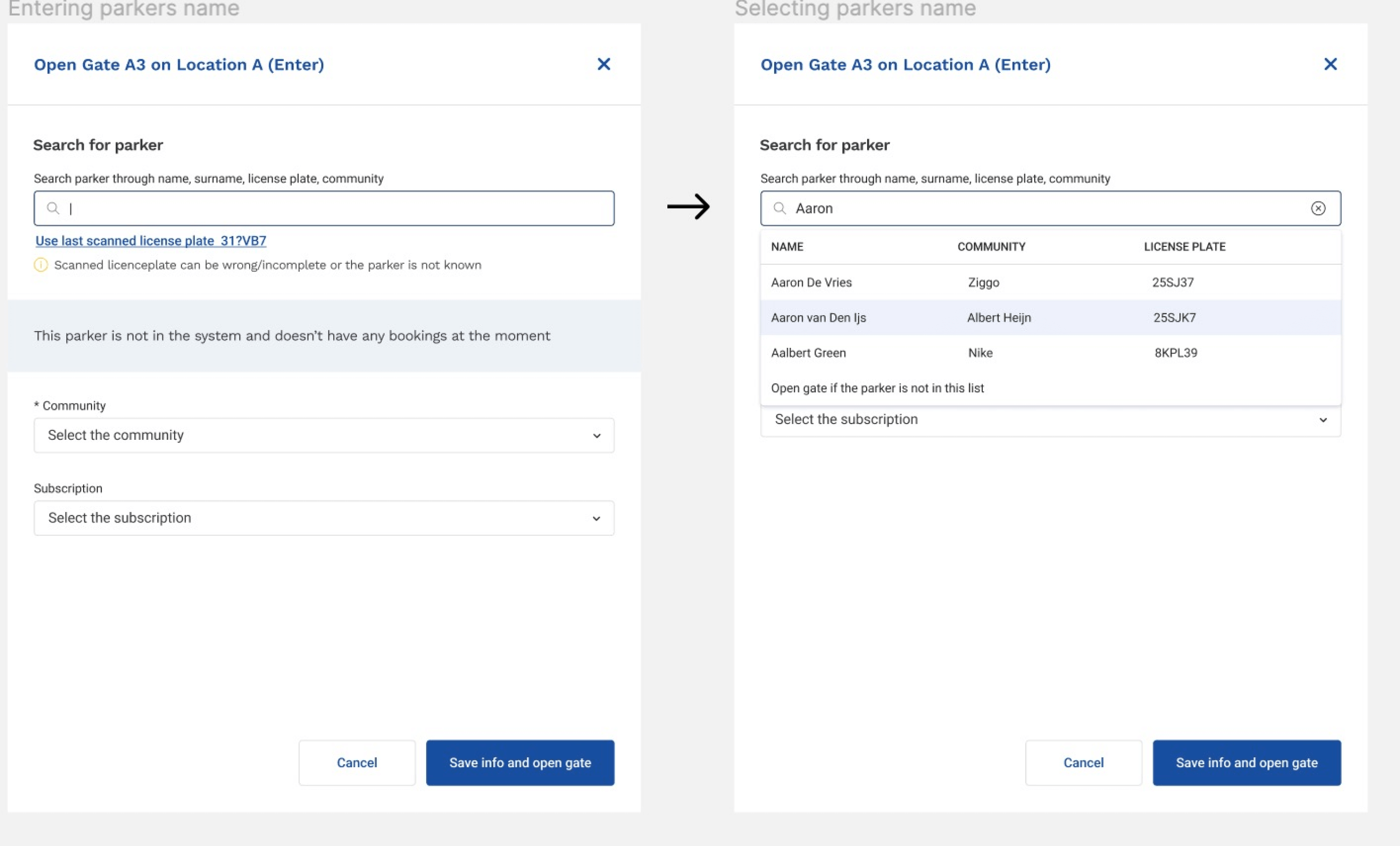
This is the default state of output in the modal window when the user is deleting a previous license plate and starts to search with parker name. This design covers the case when the license plate is incorrectly identified and the user needs to edit it, or it’s easier to search through the name with all the results in the autocomplete dropdown. Also, it’s possible to search through the community. If parker is not found in the system, the gate manager could open the gate for this person too.
Final takeaways
-
1. All you need in one place
The insights I got while conducting usability testing helped me see where users were struggling most. And thus, this opened the opportunity to change their user flow, reduce extra steps, and make the whole process easier.
-
2. Remember the restrictions
Not everything you wish for can be implemented in practice. Parking and its rules can’t be neglected. This is not a negative takeaway, but the opposite: when you know the limits of the system, you can apply your knowledge in a better way.
-
3. Prioritise and simplify
If we get to know which information is more relevant and meaningful for a user at the moment, especially when they’re in a hurry at work, we can really do them good in making their decisions.
Other projects


